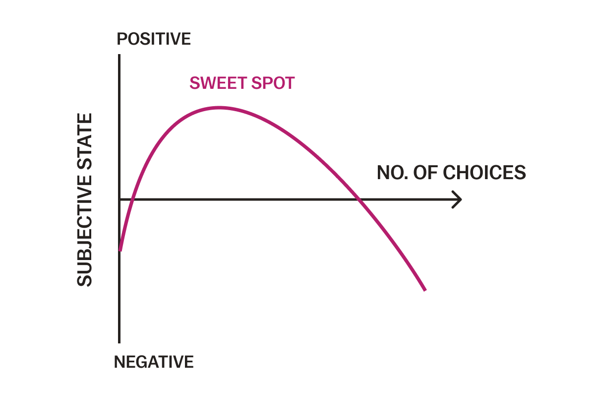
As marketers, Rokt knows customers want choices. Most people view an array of options as a positive, believing that more choices ultimately make us happier. While in some ways this is true and customers do expect options, the temptation to offer endless random choices on your ecommerce site can ultimately be a major deterrent to your business.
When customers are faced with multiple options, they more than often get overwhelmed and choose not to make a purchase at all, and if they do make a purchase, they’re often less satisfied with their experience. This is known as the paradox of choice, a phenomenon that is most prevalent on ecommerce sites where space and inventory barriers don’t exist.
Bruce Buchanan, CEO of Rokt, cites this as a key issue that negatively affects growth for online businesses. “Most businesses would naturally assume if they had a broader range of products or services that they would win in a category, but consumer behavior is such that the leading players typically have to do the complete opposite,” he says.

So what can an ecommerce business do to combat the paradox of choice, keep their customers satisfied and maximize sales?
Paradox of choice in ecommerce
While bricks and mortar retail products are limited by the physical constraints of in-store shelf space, online retailers can display 10 times the amount of product on their sites. There is almost limitless real estate available in the digital space, which is why so many ecommerce sites are plagued by the paradox of choice. Retail sites flood their consumers with pages and pages to scroll through, and consumers feel overwhelmed and are less likely to complete a purchase.
A website with an overload of options leads to increased psychological distress and confusion, distracting the brain from its task. There are three main areas where the paradox of choice can hurt ecommerce sites: the homepage, the cart, and the confirmation page. Listed below are ways you can fully optimize your site in these three areas to maximize customer engagement and value.
Homepage
When users visit your site, you want to make sure they stay there and enjoy the experience. Many sites do so by enticing them with several buttons to click, bright images, or animations. This can be disorienting and have the opposite effect. Reduce the CTAs on your ecommerce site by focusing only on those that are most relevant to your customers.
Cart
Online retailers are often tempted to overload the cart page with product upsells, loyalty programs, app-installs and more, but this can have the opposite effect and result in a high percentage of cart abandonment.
- Personalize your offers, products and services – Space for engagement at checkout is limited, so only show offers that are personalized for shoppers and will enhance their experience. Keep your check out page simple, and most importantly, relevant.
- Simplify your checkout page – Overwhelming customers while they are making a purchase usually has the opposite effect and often leads to cart abandonment. Combat this by using the space to create a seamless experience with key information and limited distractions to increase value and engagement.
Confirmation Page
The confirmation page is often overlooked in ecommerce, but it provides brands an untapped opportunity. Most companies often use this real estate in one of three ways: they show nothing (a missed opportunity), they show everything (overwhelming users), or they show three static options that are not relevant to the customer on the page.
The best way to unlock the hidden value of this page, and combat the paradox of choice, is to present customers with three most relevant offers, personalized to them.
Before working with Rokt, the Fanatics’ confirmation page had credit card sign-ups, magazine subscription offers, and multiple deals on the page, which created a static, disjointed user experience and adversely impacted revenue flow. Rokt helped streamline offers on their confirmation page by only showing messages that users were most likely to convert on, resulting in a 470% increase in yearly ancillary revenue.
Before working with Rokt, the Fanatics’ confirmation page had credit card sign-ups, magazine subscription offers, and multiple deals on the page, which created a static, disjointed user experience and adversely impacted revenue flow. Rokt helped streamline offers on the confirmation page by only showing messages that users were most likely to convert on, resulting in a 470% increase in yearly ancillary revenue..
Overcoming the paradox of choice: the Rokt solution
Rokt, helps brands overcome the paradox of choice in ecommerce by offering the most relevant and personalized choices. Rather than overwhelming customers with randomly selected offers, products, and services. Rokt’s award-winning AI intelligently gathers data and manages objectives to ensure that customers are only exposed to messages that are most relevant to them, when they are most likely to convert.
Rokt, helps brands overcome the paradox of choice in ecommerce by offering the most relevant and personalized choices. Rather than overwhelming customers with randomly selected offers, products, and services, Rokt’s award-winning AI intelligently gathers data and manages objectives to ensure that customers are only exposed to messages that are most relevant to them, when they are most likely to convert.
Instead of presenting your customers with a bunch of random options like offering winter coats to customers in Hawaii, or app-install promotions to customers who already have the app downloaded, present them with handpicked options. The best online retailers don’t just present their consumers with ‘top engaged’ offers, but personalize these messages on an individual basis, resulting in higher engagement, and deeper customer satisfaction and loyalty.
To learn more about how Rokt can help you overcome the paradox of choice and optimize your ecommerce site, visit Rokt.com or contact solutions@rokt.com today.


